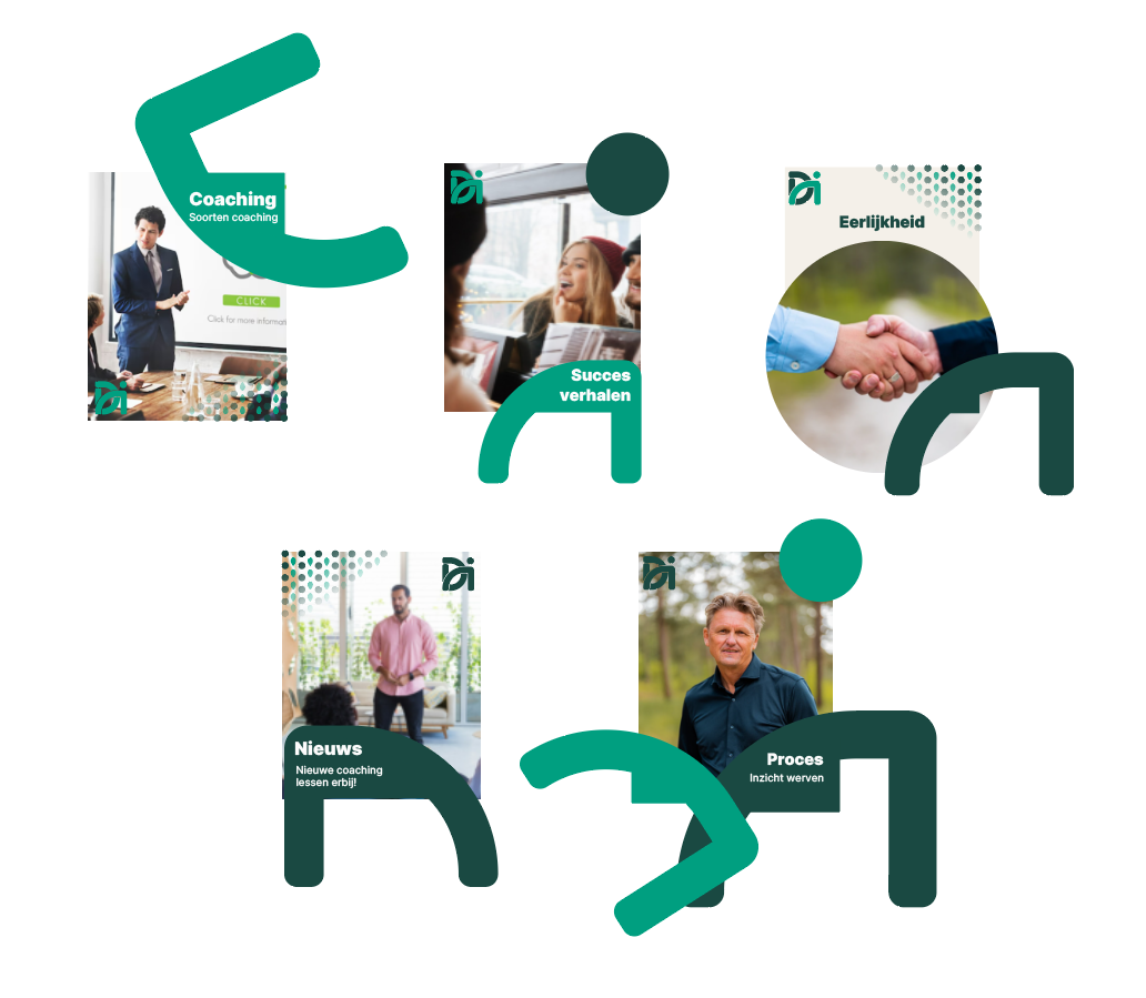
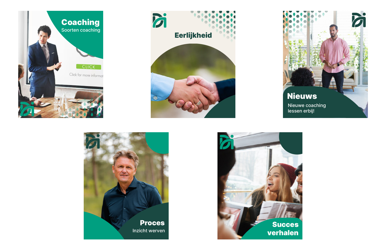
For Dick IJzer, I designed five types of social media templates. I also presented them, explaining the design choices, and I will take you through them.
Pattern
he symbol for Dick IJzer Coaching combines a leaf and a circle, representing personal growth. The leaf stands for natural development, balance, and resilience, while the circle embodies harmony, warmth, and humanity. Together, they reflect awareness, balance, and the ongoing journey of self-development. True growth at Dick IJzer Coaching emerges in a safe, supportive environment where individuals overcome blocks and reach their full potential. With years of experience in Eastern martial arts, business, and personal challenges, Dick IJzer knows that trust, empathy, and intuition are essential. The leaf and circle embody the core values of honesty, awareness, mastery, resilience, and humanity.
Design
The Dick IJzer Coaching logo represents trust, balance, perseverance, and the core values Dick embodies.
In social templates, it symbolizes strength, growth, and reliability, carefully designed to convey professionalism and confidence, the very essence of the content and guidance offered.
Every design choice, from shape and color to placement, ensures recognizability and consistency, making the logo not just a brand identity but a visual promise of quality and dedication.
Success Stories
Success stories show growth and development in action, illustrating how people and businesses unlock their full potential step by step.
The logo’s two visual elements are incorporated in the social template, with the ‘i’ of IJzer highlighted. The right-hand arc symbolizes progress and phased development, while the top-right circle represents wholeness and continuity.
The design conveys warmth and humanity, reflecting how Dick guides clients through challenges to achieve results. Inter Black, the same font as the logo, reinforces recognition and brand identity.
News and Current Affairs
News brings energy, movement, and insight, showing what’s happening and how things develop.
The visual element of Dick IJzer’s logo is integrated into this social template: the ‘I’ of IJzer can also be seen as the ‘D’ of Dick.
The left curve rises sharply then gently falls, symbolizing the initial peak of attention in news followed by clarity and understanding. The rhythm adds dynamism and flow. Rounded shapes at the top right add a human touch, emphasizing engagement, growth, and connection. The typeface Inter Black matches the logo for strong brand recognition, while Inter Regular is used for the text to ensure clarity and readability.
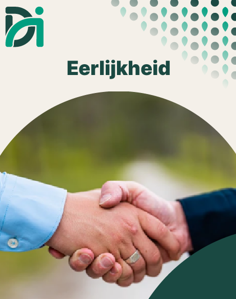
Core Values
Our core values, honesty, awareness, mastery, resilience, and humanity, form the foundation of everything we do.
The website’s background color provides recognition, while the logo’s visual elements are carefully integrated. The large curve symbolizes strength and direction, reflecting mastery and resilience. The circle and small lower curve represent awareness, showing personal growth step by step. Rounded shapes and leaves at the top right convey humanity and honesty, adding warmth and a personal touch.
The typeface Inter Black, as in the logo, ensures strong brand recognition and a clear visual identity.
Services and Products
This shows the coaching Dick IJzer offers, from personal growth to business guidance, helping people reach their full potential.
The logo’s visual elements are integrated into the template. The top right circle represents wholeness and connection, while the lower right leaves and shapes convey growth, balance, and warmth, showing coaching is personal and supportive. Inter Black matches the logo for strong brand recognition, and Inter Regular keeps the text clear and readable.
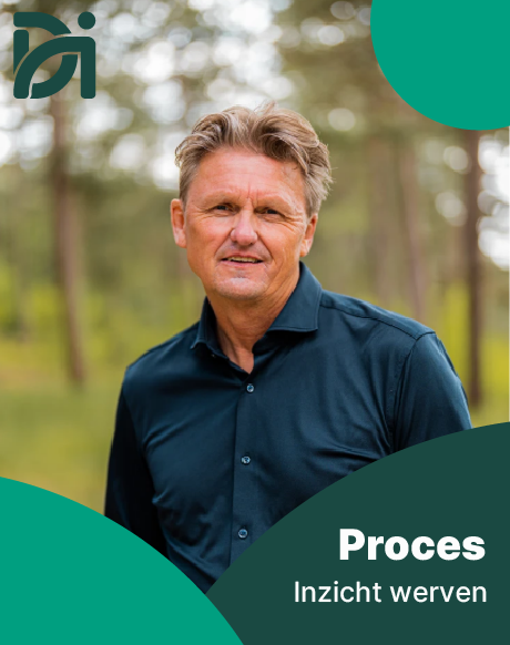
Process
The Dick IJzer Coaching process follows three steps, helping individuals and businesses reach their full potential with a focus on growth and lasting results.
The design’s three visual elements reflect these stages. Two colored fragments of the logo circle on the right represent the phases, the lower left element marks the start, and the top left leaves and shapes symbolize growth, balance, and development. Together, they show a structured, dynamic, and human-centered process. Inter Black, as in the logo, ensures brand recognition, while Inter Regular keeps the text clear and readable.