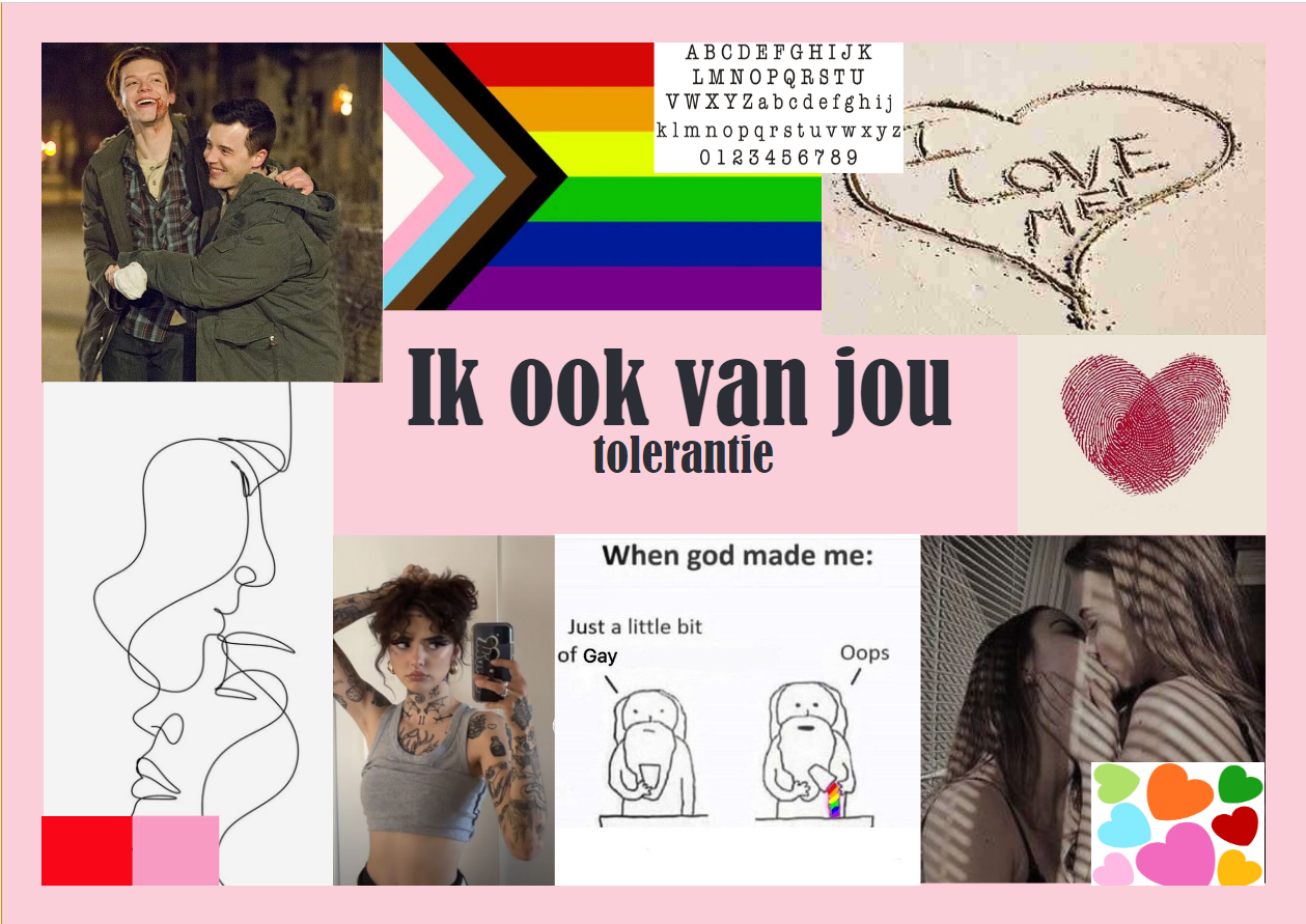
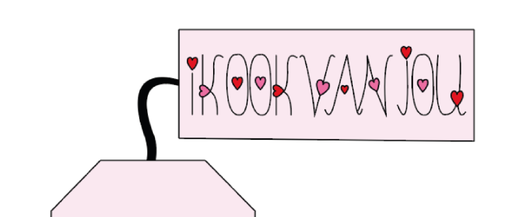
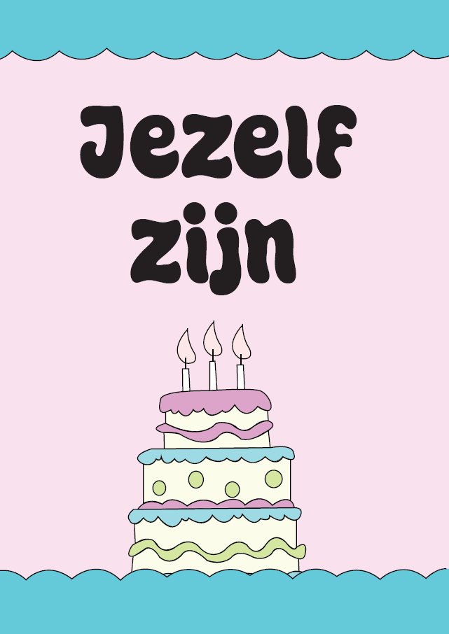
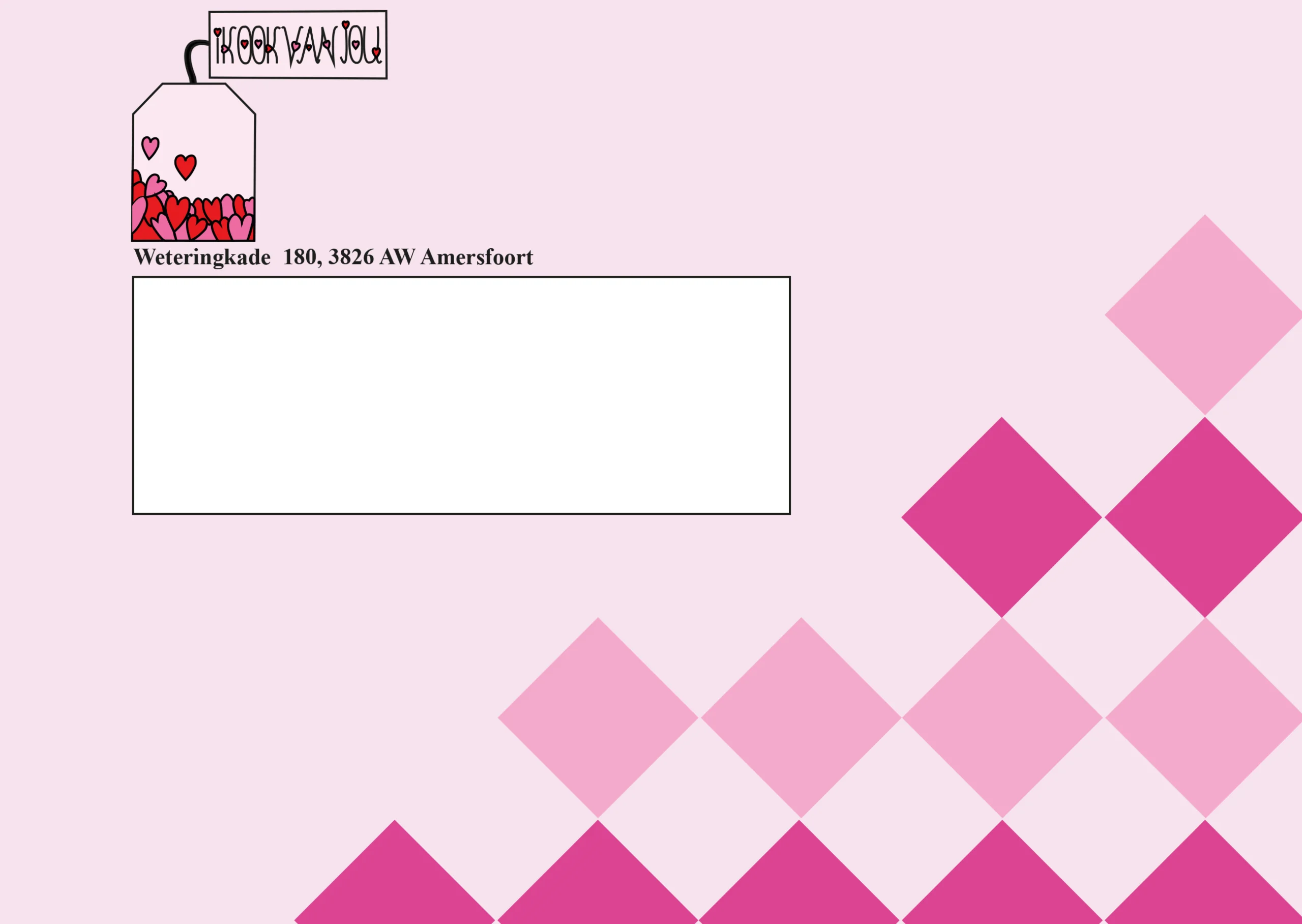
Ik ook van jou

Ik ook van jou

´Ik ook van jou´ is a company focused on creating an environment where everybody can be themselves, regardless of appearance or background. It´s all about embracing diversity whithout the pressure to conform to certain standards. The company aims to show that genuine connection happens when people feel free to be authentic, without fear of judgement. By promoting this message, ´Ik ook van jou´  strives to build a community centered on respect and understanding, where people support each other for a more inclusive society.

Moodboard

This is the mood board I created to define my style. I chose pink and red as my main colors, symbols of love, and included the Pride flag to highlight the importance of acceptance for the LGBTQ+ community. While progress has been made in some parts of the world, full acceptance still hasn’t been achieved. I also added tattoos, as they’re still not fully accepted in many places, even though they’re a meaningful form of self-expression for many people. The mood board is not only a reflection of my personal style, but also a call for inclusivity and acceptance of everyone, regardless of appearance, preferences, or personal choices.

Logo

This is the logo I designed for ‘IK OOK VAN JOU’. I started by designing the teabag and the text separately, because I wanted both elements to be strong on their own, while also working together to convey a message. The teabag represents something that anyone can share, regardless of age or background, and symbolizes the power of connection. The hearts on the teabag and in the text represent love, the core of my message. With this logo, I want people to feel seen and loved, just as they are.

Flyers

For the flyers, I chose pastel colors because they feel soft and calm, which fits well with the message of inclusivity and love. However, while designing, I realized that I should have chosen a different typeface for the text and placed the text further from the edges. These mistakes were valuable lessons that help me think more carefully about layout and typography in the future, so I can create flyers that look more professional and appealing.

Letterhead and envelope

This is the letterhead and envelope I designed. I chose pink because it has a warm, inviting feel. The pink blocks add a playful, soft atmosphere, while still keeping the design professional. I wanted the letterhead and envelope to come across as welcoming, and I think the combination of the pink color and the blocks reflects that well.

Animation

I wanted the teabag in the animation to move in order to make the design more lively and playful. The movement adds a sense of dynamism, making it visually more engaging. I learned a lot while creating the animation, and although I made some mistakes at first, I can see my skills improving — which motivates me to keep learning and growing.