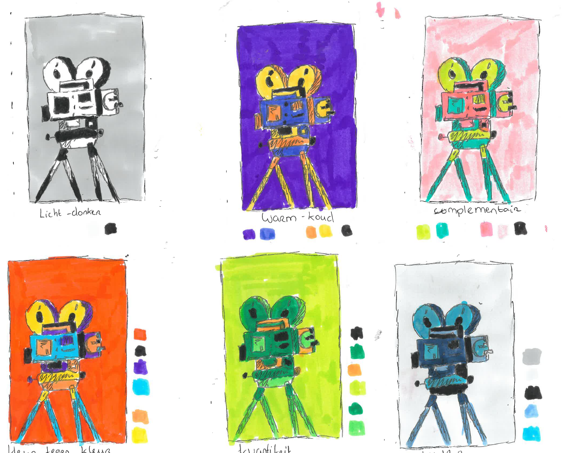
ai in de filmindustrie

Ai in the film industry

AI is transforming the film industry in many ways, from speeding up production to creating new techniques for visual effects and storytelling. But it also raises concerns about job loss and whether AI can ever truly replace human creativity, or if it will simply become a tool for filmmakers.

For my magazine, I interviewed two people to hear their thoughts on the rise of AI in the film industry. They shared their opinions on how technology is affecting creativity and jobs, and whether they are concerned about the future. The opinions are divided: while one sees AI as an opportunity for innovation, the other views it as a threat to job security and the authentic human touch that makes films unique.

Sketches

For my magazine, I created sketches of visuals for my article about AI in the film industry. After careful selection, I chose the images that best fit the message of technology, creativity, and the future. These visuals strengthen the story, even though I didn’t end up using all of them.

After trying out three different styles, I chose the third style, which adds a lot of color and vibrancy for greater visual impact. Although this style places less emphasis on text, I retained elements from the second style to preserve the composition and atmosphere I valued, creating a cohesive whole.

Color contrast

I tested six color contrasts to see which best suited my design. The combinations ‘color against color,’ ‘complementary,’ and ‘quality‘ appealed to me the most, but the complementary colors created a watermelon effect, while ‘quality’ felt too dark. In the end, I chose the ‘color against color’ combination because of its bright, energetic look.

5 images

These are the five images I created, deliberately combining paper and digital techniques. This approach allows me to take advantage of the tactile qualities of paper as well as the speed of digital editing, resulting in a more dynamic final outcome. For the back, I chose light blue and pink, which complement the overall look and create a visually appealing balance. I also cut out pieces of cardboard to use as words, adding a playful, handmade feel that contrasts with the digital elements.

Final results

The magazine consists of a cover, an opening spread, and a follow-up spread. For the cover, I replaced the background with yellow and added colored blocks that also appear in the five images, creating a consistent color palette.

For my magazine, I used the typefaces Acumin Variable Concept (bold), Hanken Grotesk, Super Ocean, and Cooper Black. This selection supported the visual style and message of the design. This module was truly educational for me. It was an interesting experience because I stepped outside my comfort zone with the design work, which I found very stimulating. The entire process not only gave me new insights but also further developed my creative skills, making me more confident in my designs.